Typography /Task 2: Typographic Exploration & Communication


04/10/2022 - 10/10/2022  /// Week 6 - Week 7
Osezua Ehizogie Ejodame / 0351565 
Typography /Bachelor of Computer Science (Honours)/Creative Media Design(Minor)/ School of Computer Science
Task 2 Exercises: Typographic Exploration & Communication


LECTURES 

Completed


INSTRUCTIONS


Task 2: Typographic Exploration & Communication

Fig 1.1 Layout #1 Week 6 (03/10/2022)

My idea for the heading was that of a Tipping Scale using the letter "T". I got a lot of useful feedback and tried my best to apply it to the further layouts.

Font: Janson Text LT Std,
Typeface: Roman (Body text), Italic (caption), Bold (Heading)
Type size: 11 pt (body text) 11 pt (caption), 300 pt and 40 pt (heading), 11 (lead in text)
Leading: 13.2 pt (body text) 13.2 pt (caption), 24 pt (heading),
Paragraph spacing: 11 pt
Character per line: 52 characters
Alignment: Align left
Margin: 10 mm (All)
Columns: 2
Gutter:  5mm

Fig 1.2 Evolution of the heading, Week 6 (05/10/2022)

Making the point size bigger for the words "Follow" and "Code". Placing the words to flow diagonally.

 
Fig 1.3 Layout #2 Week 6 (06/10/2022)
After implementing the feedback I got, I like this layout better than the first one. I tried using semi circles as weighing scales for the body text on the right hand side but I am not too sure if I like this change or not.

Font: Janson Text LT Std,
Typeface: Roman (Body text), Bold (caption), Bold (Heading), Bold (Lead in text)
Type size: 10 pt (body text) 11 pt (caption), 337 pt and 52.16 pt (heading), 15 (lead in text)
Leading: 12 pt (body text) 13.2 pt (caption), 62.6 pt (heading), 18 (lead in text)
Paragraph spacing: 12 pt
Character per line: 52 characters
 
Fig 1.4 Layout #3 Week 6 (07/10/2022) 
In this layout I try moving the lead in text to the right and giving it a bold italic typeface and placing a semi circle under it. After seeing this layout I know now that I want the heading and lead in text to be on the same side of the page and the extra semi circle should be removed all together.

Font: Janson Text LT Std,
Typeface: Roman (Body text), Bold (caption), Bold (Heading), Bold italic (lead in text)
Type size: 10 pt (body text) 11 pt (caption), 337 pt and 52.16 pt (heading), 19 (lead in text)
Leading: 12 pt (body text) 13.2 pt (caption), 62.6 pt (heading), 22.8 (lead in text)
Paragraph spacing: 12 pt
Character per line: 52 characters
Alignment: Align left, Align centre (lead in text)
 

Fig 1.4 Layout #4 Week 6 (08/10/2022)  

So far this is the layout I like the most. I made the lead in text flow diagonally on top of the "T" and tried making the text follow a diagonal direction like the tipping scale.

Font:
Janson Text LT Std,
Typeface: Roman (Body text), Bold (caption), Bold (Heading), Bold italic (lead in text)
Type size: 10 pt (body text) 11 pt (caption), 337 pt and 52.16 pt (heading), 19 (lead in text)
Leading: 12 pt (body text) 13.2 pt (caption), 62.6 pt (heading), 22.8 (lead in text)
Paragraph spacing: 12 pt
Character per line: 55 characters
Alignment: Align left, Align centre (lead in text) 
 

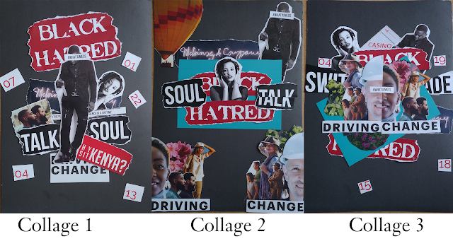
Final Task 2 Submission

Fig 1.5 Final Submission with grids and guides JPEG Week 7 (11/10/2022)

Fig 1.6 Final Submission  JPEG Week 7 (11/10/2022)


Fig 1.7 Final Submission PDF Week 7 (11/10/2022)


FEEDBACK 

Week 7


Week 6

1. Do the expressions match the meaning of the words?

2. Are the expression well crafted (crafting/lines/shapes)?

               2a. Do they sit well on the art-board

               2b. Are the composition engaging? Impactful?

3. Are there unnecessary non-objective elements present?

4. How can the work be improved?

TEXT FORMATTING

1. Is kerning and tracking appropriately done?

2. Does the font size correspond to the line-length, leading & paragraph spacing

3. Is the alignment choice conducive to reading?

4. Has the ragging been controlled well?

5. Has cross-alignment been established using base-line grids?

6. Are widows and orphans present?


General feedback: A good idea but in needs some more work.

Specific feedback: The heading should not be in the gutter. It would be better to move the heading to the left side and also increase its size.

 The point size of the body text could be decreased by 1 in order to have more space for the heading.


REFLECTIONS  

Experience

Doing this project was very beneficial to me as I learned what to do and not to do when making layouts.  

Observations
Experimenting with many different layouts was a good way to sort trough all the ideas and had in mind and choose the best fit for the task.

Findings
Headings generally are not placed in the middle of the page. When making headings its best to make it visible and easy to read.

FURTHER READING

The Vignelli Canon(2015)
 

In the "a timeline" chapter on page 30 they discussed on the responsibility designers have when doing their jobs.
 
Initially, when I thought about a designer's job, I thought about investing everything you have into creating one perfect design. I never stopped to consider how designers also need to be economical when they work, not just trying to make something look attractive, although that is important as well. Designers must develop a sense of equilibrium in order to meet the demands of their customers, create the best solution possible, and be mindful of their economic state.
 
 
Reference:
Massimo Vignelli (2015). The Vignelli canon. Zürich: Lars Müller Publishers.

Massimo Vignelli (2015). The Vignelli canon. Zürich: Lars Müller Publishers.

Massimo Vignelli (2015). The Vignelli canon. Zürich: Lars Müller Publishers.

Massimo Vignelli (2015). The Vignelli canon. Zürich: Lars Müller Publishers.

Massimo Vignelli (2015). The Vignelli canon. Zürich: Lars Müller Publishers.

Comments

Popular posts from this blog

FINAL COMPILATION

Typography /Task 1: Exercises

DIGITAL PHOTOGRAPHY AND IMAGING - Project 2: Photoshop exercises & Conceptual Product Photoshoot