07/04/2023 - (Week 1 - Week 4)
Osezua Ehizogie Ejodame / 0351565
Design
Principles/Bachelor of Computer Science (Honours)/Creative Media Design
(Minor)/ School of Computer Science
Exercises
LECTURES
Week 1 - Elements and principles of design
The elements of design include point, line, shape, form, texture, space and
contour.
Topic 1: Contrast & Gestalt Theory
Contrast: Juxtaposition of strongly dissimilar elements. This means placing
the elements together to create an interesting effect, this effect prevents
the visual experience from being monotonous. Contrast can be found in shapes
and colors.
Gestalt: The principles describe how the eyes perceive visual elements as a
single art form and not separate elements. Some principles include:
Similarity: Elements that are similar tend to be grouped together.
Proximity: Elements that are close to each other can be grouped together.
Closure: Elements that do not touch each other can be perceived as having
visual continuity.
INSTRUCTIONS
Chosen Design principles:
- Emphasis
- Movement
- Repetition
Emphasis
1. Recap:
The aspect of a design that the viewer immediately notices or what captures their attention. The focal point and contrast with the rest of the design should make it stand out even more.
2.1 Visual References

|
|
Fig. Example for Emphasis
|

|
Fig. Example for Emphasis
|
2.2 Idea Exploration and Description

|
|
Fig. Rough Emphasis Idea Sketch
|
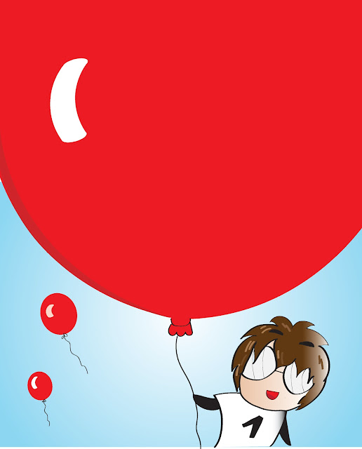
In order to illustrate the concept of "emphasis," I envisioned a large
balloon occupying most of the page, utilizing its significant size to
establish a sense of "dominance." To further make the balloon a focal
point in the design, I intend to use a red color while employing fewer
dominant colors for the background and the child holding the balloon.

|
|
Fig. 1st Attempt
|
2.3 Final Design
 |
| Fig. Final Design for Emphasis |
The 2nd attempt for Emphasis is better than the 1st as the light shows more emphasis on the balloon.
The two balloons are a good addition, but you could try and make another design but without them to see if the emphasis idea still shows.
Movement
1. Recap:
Movement in the image happens when an object or person appears to be in motion. The design should make the viewers eyes follow along with that movement.
2. Design Process
2.1 Visual References

|
Fig. Example for Movement
|
2.2 Idea Exploration and Description

|
|
Fig. Rough Movement Sketch Idea
|
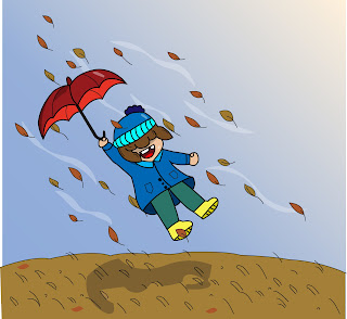
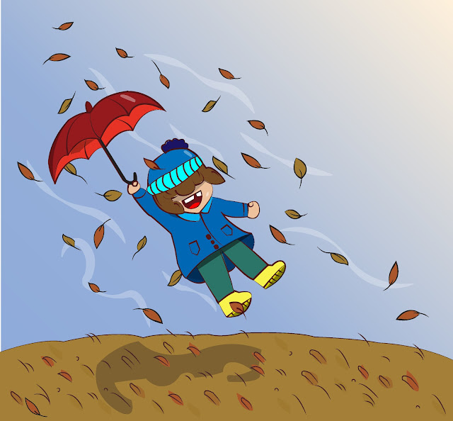
The idea of movement is depicted in how the child is being blown away by
the wind while holding unto the umbrella. The direction of the leaves
and the flowers on the ground should also add to the idea of the
movement of the wind.
 |
| Fig. 1st Attempt |
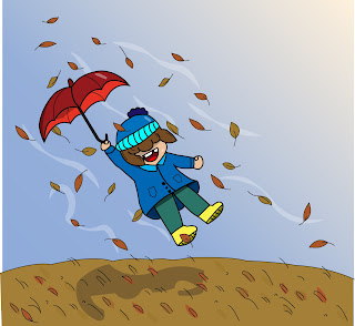 |
Fig. 2nd Attempt
|
2.3 Final Design
 |
| Fig. Final Design for Movement |
The Final Design features the girl being blown into the air by wind. For the final design I tweaked the grass a little and also scattered the leaves, so they look more natural and not just pointing straight upward.
2.4 Feedback
The idea is good, but you could experiment and make the lines more stylized, maybe using thicker and thinner strokes.
Repetition
1. Recap:
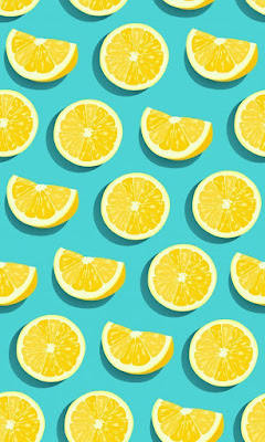
Repeating an aspect of a design can create a pattern. Patterns are generally nice to look at.
2. Design Process
2.1 Visual References
.jpg) |
| Fig. Example for Repetition |
2.2 Idea Exploration and Description
 |
| Fig. Rough Sketch for Repetition |
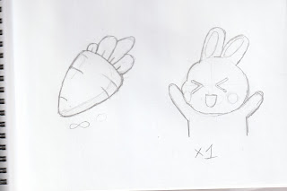
From the visual reference I would also like to make something similar but with carrots, then I thought of how rabbits liked carrots.
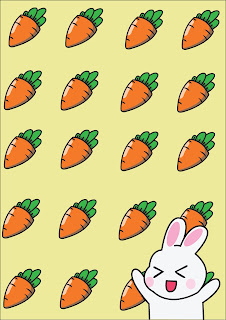
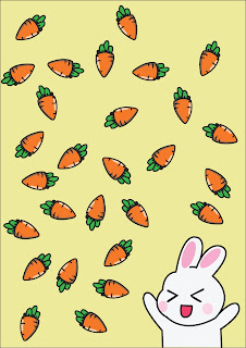
So, the basic idea of my design will be a bunch of carrots that express repetition and a cute rabbit character in the corner happy from all the carrots it has around itself.
 |
| Fig. Repetition Version 1 |
 |
| Fig. Repetition Version 2 |
2.3 Final Design
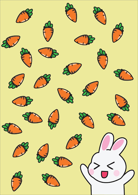 |
Fig. Final Design for Repetition
|
2.4 Feedback
Version 2 will be better as a final design as version 1 is a bit rigid. Some carrots can be moved slightly to get rid of awkward empty spaces.
2.5 Reflection
With emphasis I was quite worried as it was my first design. I am more used to sketching traditionally so digitalizing my design in Adobe Illustrator was a new experience, but I feel like I learned a lot from this.
In the movement design I have gotten slightly more comfortable with using Illustrator and am quite happy with how the design turned out. My biggest struggle for some time was in designing the wind.
I enjoyed making the repetition design the most, although it took less time to do compared to the others as I had gotten a better idea on how to work with illustrator and vectors.


.jpg)


Comments
Post a Comment